
Font Clock
Made by Established & Sons
Designed by Sebastian Wrong
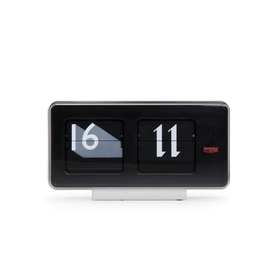
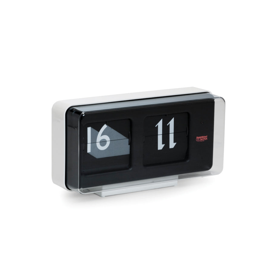
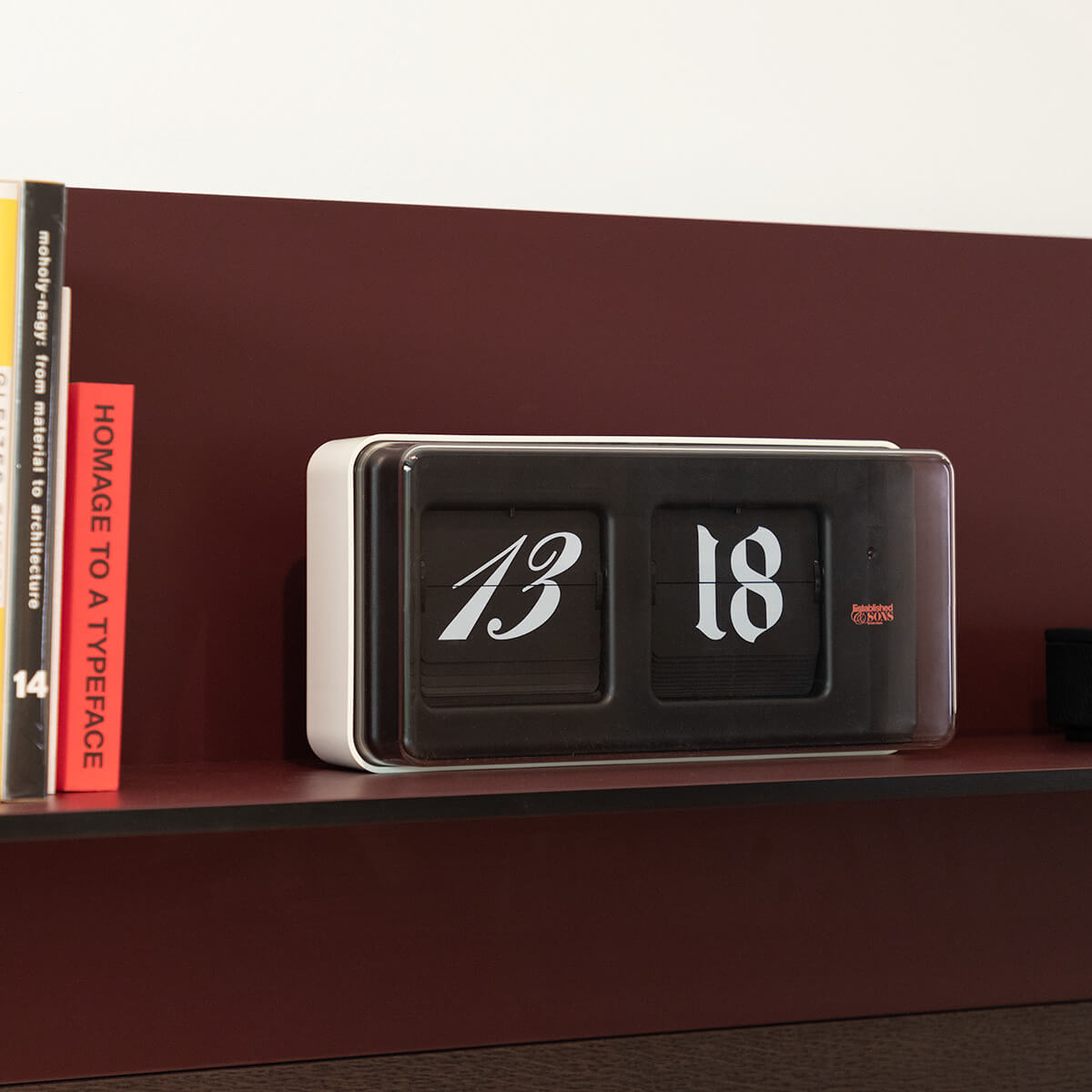
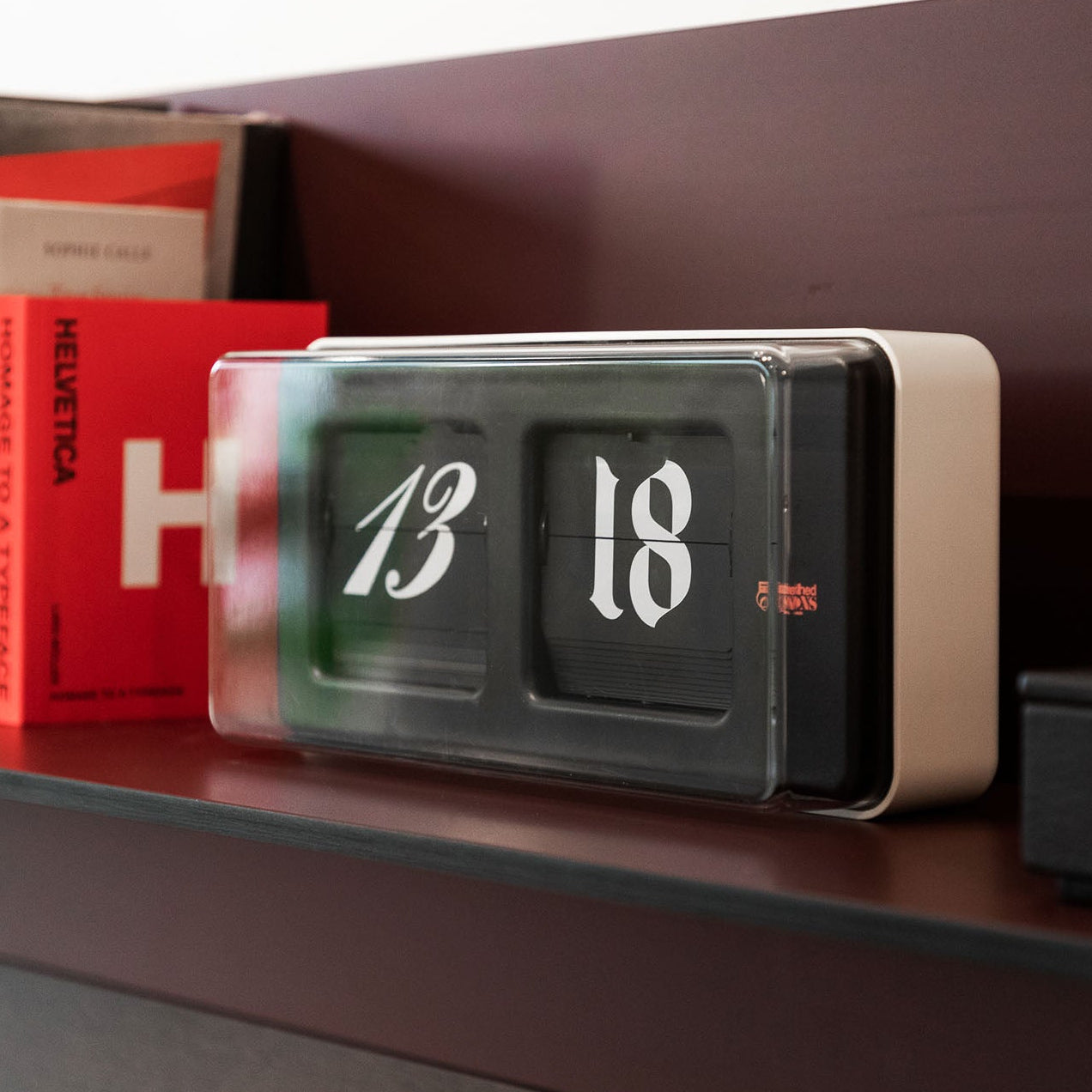
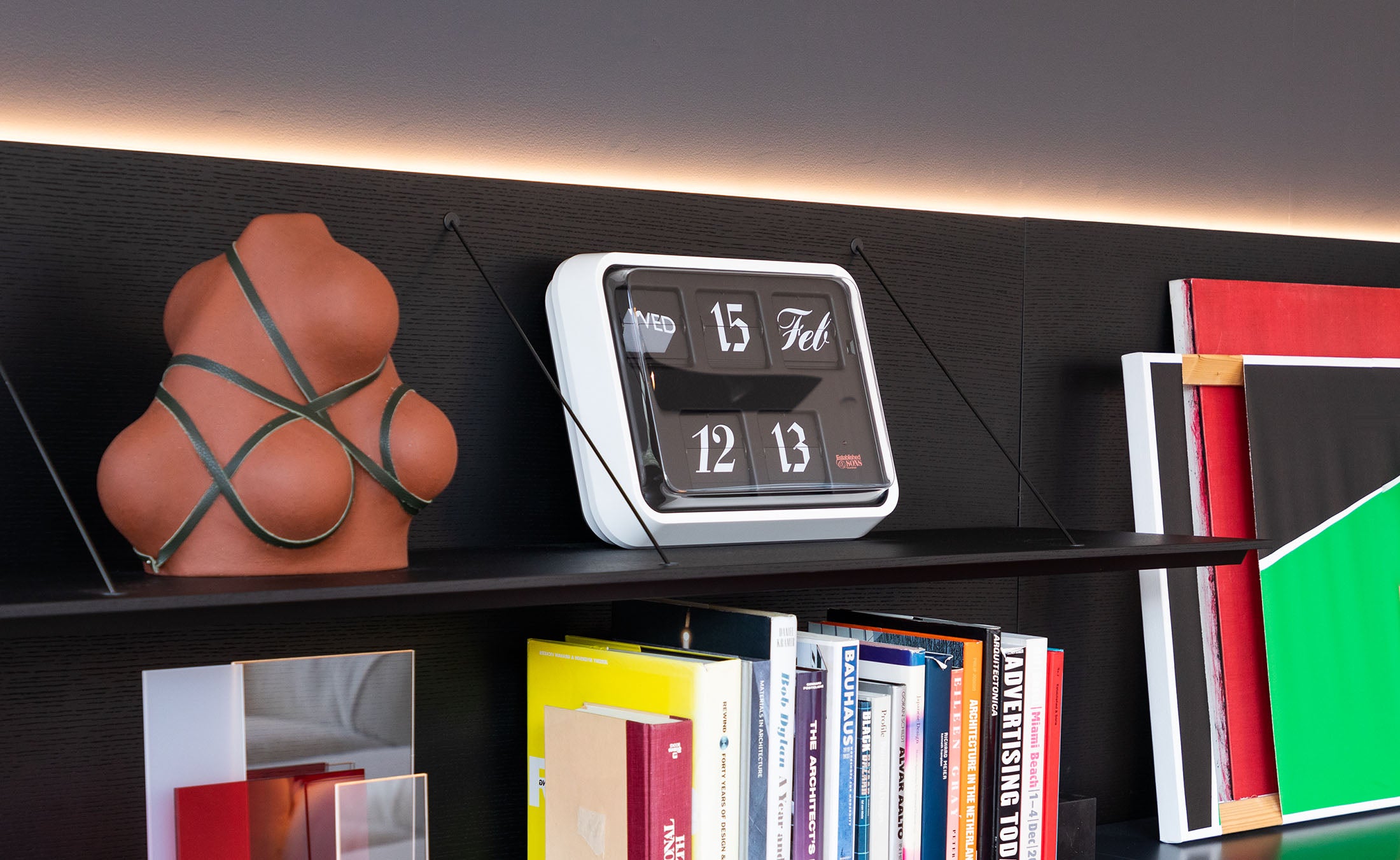
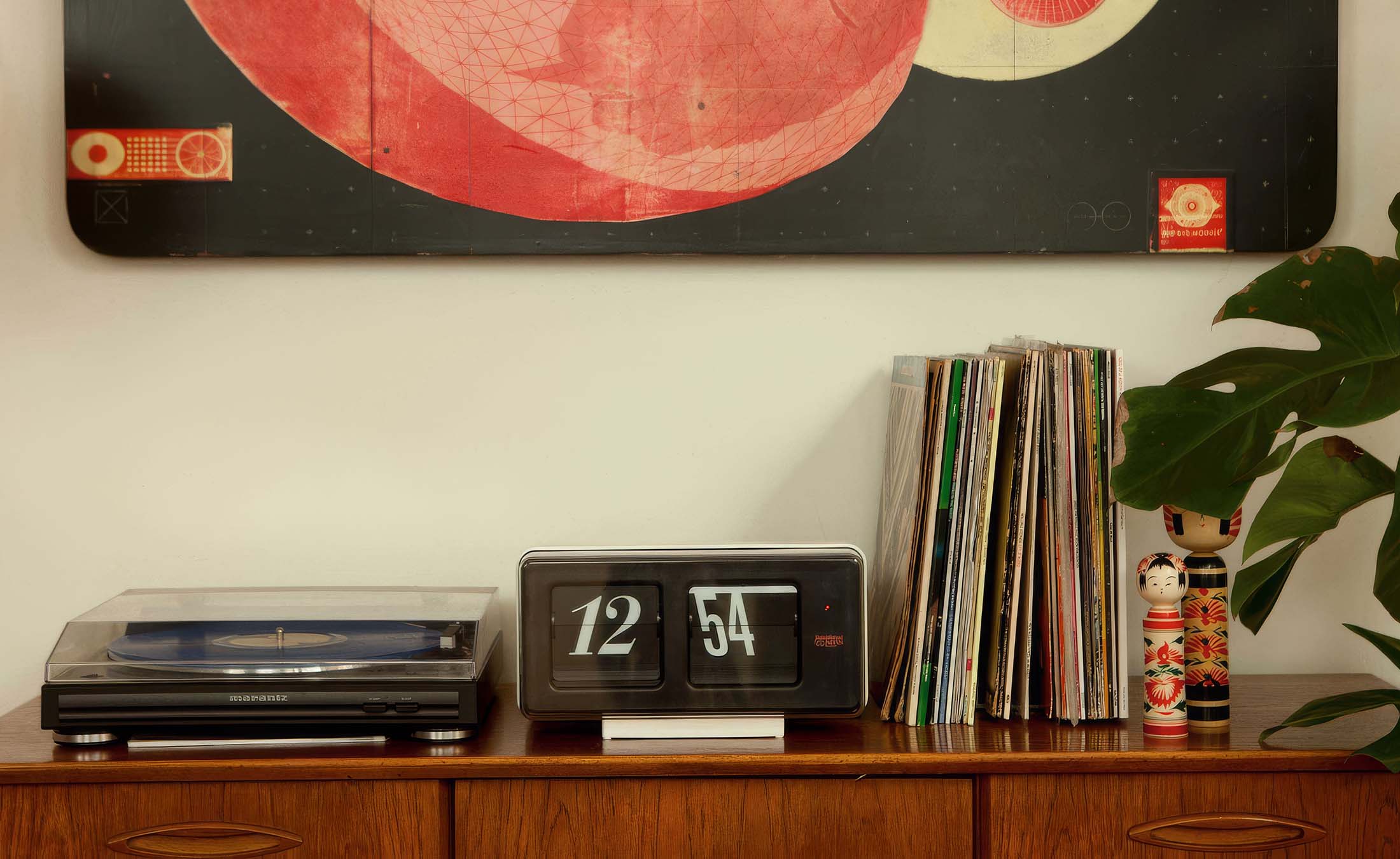
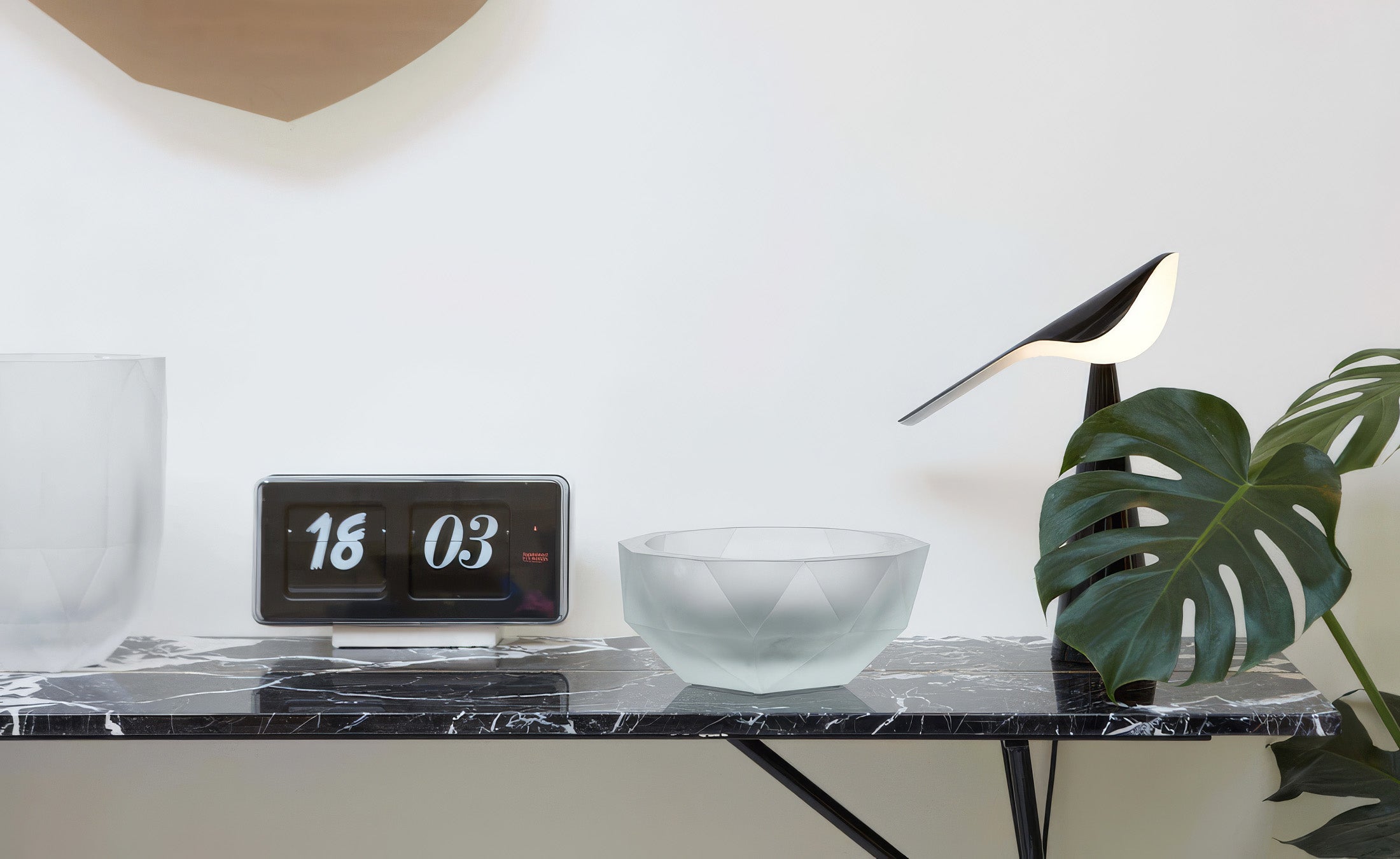
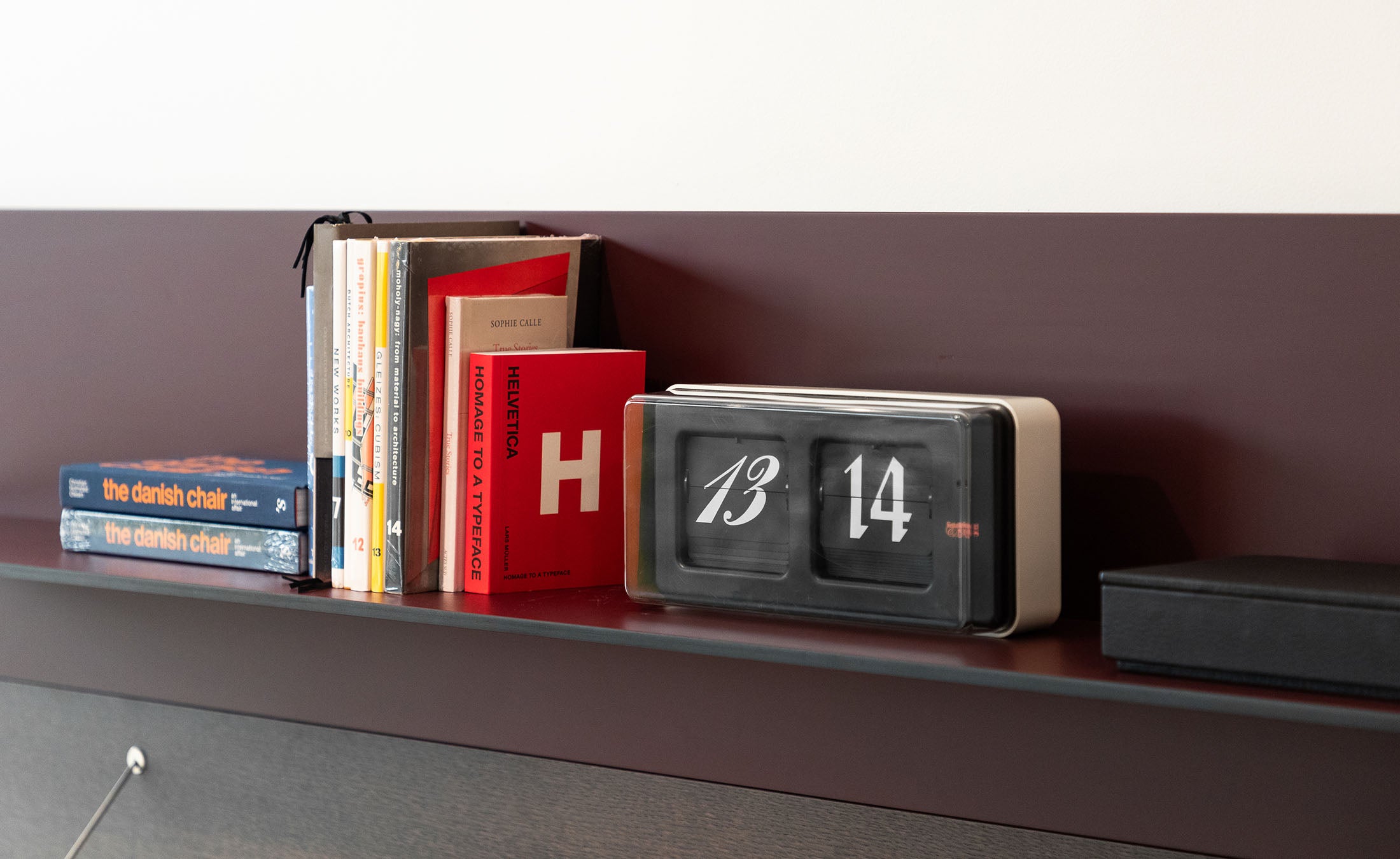
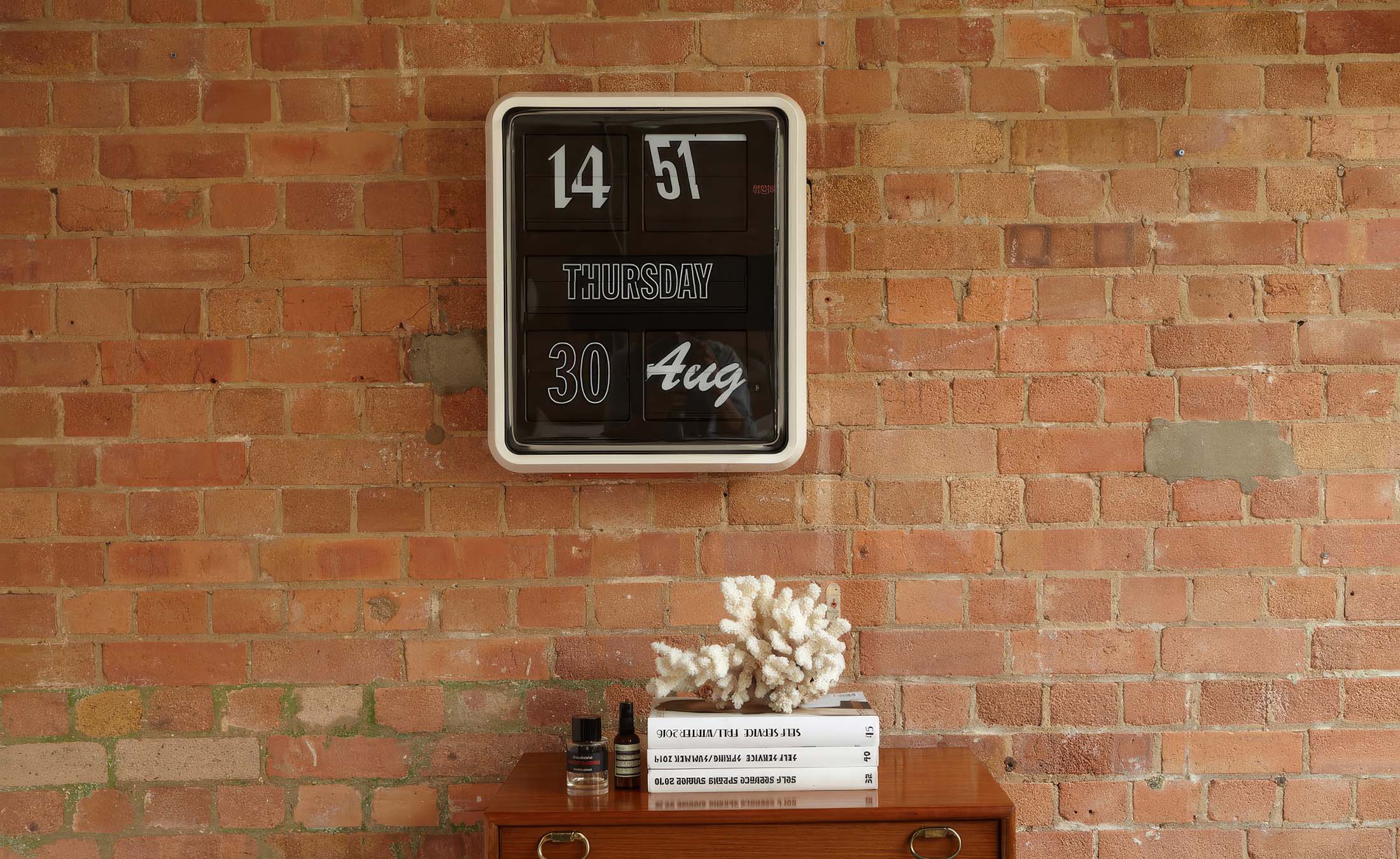
Sebastian Wrong conceived the Font Clock as a meditation on typographic history, assembling twelve typefaces, eleven from the twentieth century and one English script from the eighteenth, into a single working flip clock. Each font was chosen for its design strength and its distinct visual identity, so the clock face reads less like a dial and more like a curated specimen sheet.
The result is quietly theatrical. For most of the day, the typefaces appear in unpredictable rotation. Once every twenty-four hours, for exactly five minutes, all twelve align simultaneously, a fleeting moment of typographic order that rewards the attentive observer.
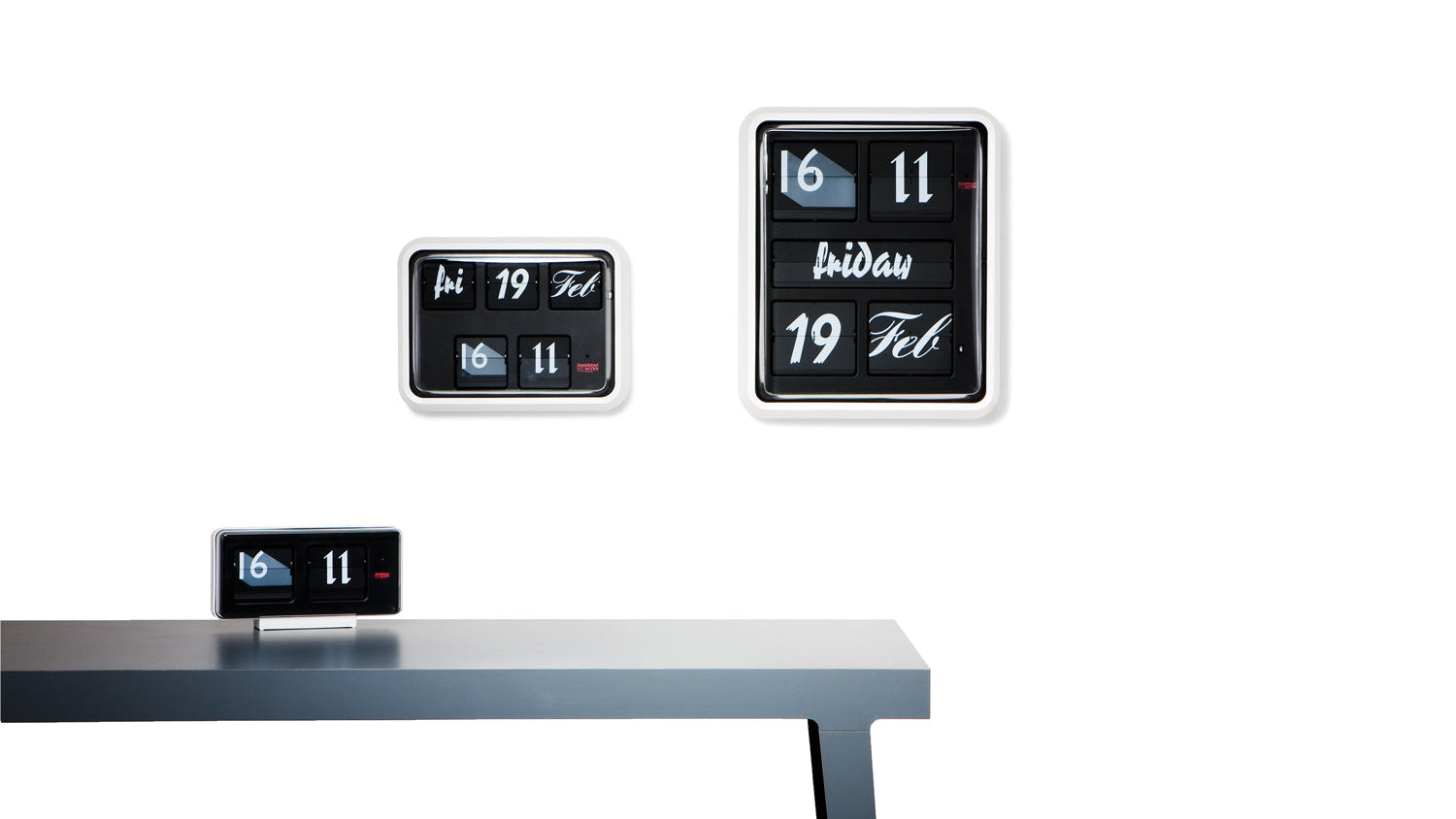
- Available in three sizes: a small desk clock in 24-hour format, and medium and large wall clocks that display the time, day, and date
- Twelve typefaces selected for individual design character
- Conceived as a wink to the British 24-hour design canon
The Font Clock occupies the space between object and idea, a piece that draws equally from graphic design history and the quiet ritual of reading time.
6 in stock. In stock, ready to ship.
Save 15% for a limited time.
Pairs well with
Font Clock
Product Details
Details
Tear Sheet
Shipping, Returns, & Warranty
Please refer to our shipping and return & exchange policy.
The product comes with a full manufacturer warranty. Luminaire is an authorized retailer of Established & Sons.
Authenticity guaranteed. Font Clock is a genuine product, sourced directly from Established & Sons.
Frequently Asked Questions
How does the Font Clock display the time?
The Font Clock uses a flip mechanism that cycles through twelve different typefaces to show the time. Once per day, for a five-minute window, all twelve fonts align simultaneously. The small version displays time in 24-hour format, while the medium and large versions also show the day and date.
Who designed the Font Clock?
The Font Clock was designed by Sebastian Wrong, the British designer and co-founder of Established & Sons. Wrong is known for work that bridges conceptual rigor with precise craft, and the Font Clock reflects his interest in graphic and typographic history.
What typefaces are used in the Font Clock?
Sebastian Wrong selected twelve typefaces for their individual design strength and distinctiveness. Eleven originate from the twentieth century, spanning a broad range of typographic traditions, and one is an English script typeface from the eighteenth century.
What sizes does the Font Clock come in?
The Font Clock is available in three sizes. The small version is a desk clock, while the medium and large versions are designed for wall display. Size determines both the display function and the scale of the typographic composition.
Is the Font Clock suitable for a design-forward office or residential interior?
The Font Clock sits comfortably in both contexts. Its restrained palette and typographic concept make it a natural fit for interiors where objects are chosen for cultural resonance as much as function, including studios, libraries, and collector residences.


We love Established & Sons too!
Have any questions about this product or any other product by Established & Sons, get in touch! We are here to help.
-
Speak with a design consultant
We can help answer any questions you have. Give us a call.
-
Send us a message
Prefer to get an answer to your question via email? Drop us a line.